Friday, 21 December 2012
Photoshoot risk assessment sheet
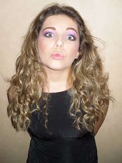
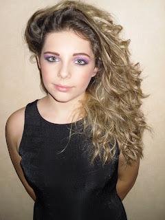
Here is proof of my risk assessment sheet i filled in regarding the safety of the locations and technologies i used to take the photos.
Thursday, 20 December 2012
Wednesday, 19 December 2012
Tuesday, 18 December 2012
Friday, 14 December 2012
Mood board of ideas for my music magazine
I carried out alot of research into what my magazine should look like and what i want it to look like, all my ideas are shown on my moodboard. I have included alot of images of how i would like my photography of female models to look, features I would include and my targeted audience.
Monday, 5 November 2012
Research and planning: Content analysis of 2 contrasting music magazines
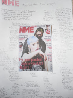
The following posters are an analysis of the contents of 2 contasting music magazines. I chose to analyse the two magazines NME and Rock sound. The target audience for NME magazine is music lovers, both genders, ranging from 17 to 30 year olds due to the content and the swearing, therefore it is not recommended for younger ages. The target audience for Rock sound is both genders, roughly 12- 18 year olds who like to know the latest up and coming bands.
The publisher for NME magazine is IPC and the publisher for Rock sound is Freeway Press Inc.
The publisher for NME magazine is IPC and the publisher for Rock sound is Freeway Press Inc.
Friday, 26 October 2012
Task 2- Market research
Market Research
In this task I had to find out what music magazines already exist in the UK and had to analyse their target audience, who buys the magazines, the publishers of the magazines and its circulation figures.
I found out that there is a gap in the market for a music magazine focusing on female pop icons for example beyonce, rihanna and Nicki Minaj, as there is only Top of the Pops that has this genre of magazine.
Monday, 22 October 2012
Introducing the main task and initial ideas MUSIC MAGAZINE
Now that I have completed my preliminary task of producing a front cover and contents page for the college magazine.
My main task is to professionally produce the front page, contents and a double page spread of a new muisc magazine. Ensuring all of the images and text included are my own and it has to have a minimum of 6 expertly taken and appropriated edited images.
I am going to produce a music magazine focused at girls and by conducting some market research on what girls like to see in magazines that already exist and then I will incorporate the features girls like in my magazine, however I will focus it mainly on music.
The content of my magazine will be articles on famous musicians, the latest music, interviews with icons such as Lady Gaga, Rihanna (musicians that girls listen to), celebrity/musician gossip, reviews of gigs/concerts and festivals, images of concerts/festivals and include the music charts.
I am going to target my magazine at girls ranging from 12-18 year old and include different genres of music in my magazine such as Pop,R&B, Soul and rap to appeal to more people.
Thursday, 4 October 2012
Tuesday, 2 October 2012
magazine
The magazine VERGE has used Eliza Doolittle as the model,
she is positioned central on the page pulling a strange pose with her fingers
above her eyes. She attracts the reader’s attention immediately as the
background is white contrasting her black hair and she is wearing a bright orange
coloured jumper. Her face is brightly lit and very clear also attracting the
reader. The editor had used colour schemes of yellow, orange, red which are all
warm colours however they have contrasted this effect with blue which has the
connotations of cold.
Friday, 21 September 2012
Thursday, 20 September 2012
Semiotic analysis of magazine cover
The above powerpoint allowed me to explain the purpose of semiotics.
Tuesday, 11 September 2012
Hi i'm Isabel,
I am also studying AS psychology, AS business and AS sociology.
My coursework brief for media studies is to produce a front page of a new school/college magazine using DTP and an image manipulation programme featuring a photograph or a student in medium close-up plus some appropriately laid out text and a masthead. I also must produce a DTP mock-up of the layout of the contents page to demonstrate i know how to use the program. Then for my main task i have to design a front page i also have to produce a contents page, a double page spread for a new music .
Subscribe to:
Comments (Atom)


